Harsh Kapadia
CHIEF CREATIVE OFFICER 🇺🇸 🇦🇺 🇬🇧 🇮🇳


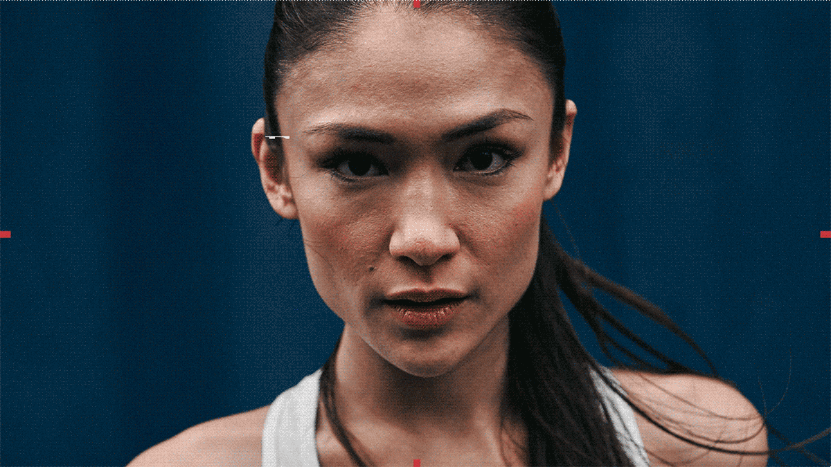


The athletic category is visually uniform, with brands relying on similar elements to convey their messages. Athletic brands often use dark, dramatic action photography with white sans-serif fonts. Tonally, visuals tend to overindex on toughness to communicate strength.
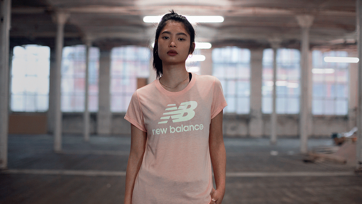
None of this felt true to New Balance. To convey the brand’s differentiated approach to athleticism, we focused on elements that felt sophisticated and editorial, communicating strength through a sense of bold, individual independence.
Our visuals rely on thoughtful portrait photography, clean white backgrounds and a serif font (Didot) inspired by the brand’s historic characteristic advertising. Graphic “field of play lines” were introduced to subtly and cleverly reference specific sports, and we instituted “power words” to express a tone/spirit through a single thought-provoking word. Additionally, high-impact words and phrases feature “glitches” to further reinforce the principles of character and nonconformity.